Contents
How To Read Crypto Charts?
Crypto charts can be confusing at first glance, but they’re actually relatively simple to understand. The most important thing to pay attention to is the price action. This is the movement of the crypto prices over time and can be represented by a line or candlestick chart.
Learning how to read crypto charts is essential if you’re interested in crypto trades and following the marketplace. But much like blockchain, technical analysis and market trends have a very steep learning curve.
In this article, we will go over the key concepts you need to begin your journey into technical analysis.
To begin with, let us go over the Dow Theory – a long-standing form of technical analysis written by Charles Dow.
1. Markets Have Three Types Of Movements
2. Markets Have Three Major Phases
4. Averages In The Markets Must Confirm Each Other
6. Trends Exist Until They Definitively Don’t
What To Look For In Crypto Charts
Contributing Factors to Observe
Tips For Using Crypto Charts To Make Smart Trades
Contents
The Dow Theory
So what is Dow Theory? And how do its tenets apply to crypto? There are six parts to this theory.
1. Markets Have Three Types Of Movements
The main movement is essentially the long-term outlook. How does the price of an asset look over the course of a year or more. The medium swings are price changes over the course of 10 days to three months. Finally, short swing so the smallest trend lines, how is the asset behaving hour to hour.
Looking at all these trends is key to understanding how the market feels about an asset.
2. Markets Have Three Major Phases
The accumulation phase is where investors that are in the know are purchasing an asset before the market catches on. Then the absorption phase begins and rapid price changes begin as the larger public starts to participate. Lastly, the distribution phase is when early investors begin to sell off their holdings.
3. Market Discounts All News
Any new information is very quickly reflected in the market. The sum of the world’s hope, fear, projection, and history are all taken into account.
4. Averages In The Markets Must Confirm Each Other
Essentially, this means that if solar energy stocks are surging in price, you would also expect solar panel manufacturers to be surging in price. Markets that rely on each other should generally move together.
5. Volume Confirms Trends
When there’s a very small amount of actors in the space, and there are price swings, it could be related to anything, it’s hard to tell the motivations of one or a few people in a market. On the other hand, if price swings happen in large volumes, then it’s more indicative of the state of the asset. When many people act in a certain way, it’s a more clear trend.
6. Trends Exist Until They Don’t
This one’s pretty simple. It’s basically saying to look at the big picture. Always give the longer term trend the benefit of the doubt when there are short-term market swings. It’s very tough to know when one trend is ending and a new one is beginning. So err on the side of the long term pattern.
So these are the six major points of the Dow Theory. And I’m sure you can already see many of the ways that they apply to crypto markets.
There are a few more tips we’ll cover today that when combined with Dow theory can help to give you a clearer picture of an asset.
And as we combine these points with other contributing factors, we can observe the crypto market from different angles.
But before we dig into the difficult stuff, you must familiarize yourself with what to look for in crypto charts and understand the basics of how they work.
So let’s jump in!
What To Look For In Crypto Charts
When you’re looking at crypto charts, there are a few things you need to pay attention to and grow familiar with.
First, you need to identify the crypto price trend.
This can be done by looking at the price action over time. If the crypto prices are consistently rising, then it’s likely that the crypto is in a bull market. However, if the crypto prices are falling, then it’s likely that the crypto is in a bear market.
You also need to pay attention to crypto volume.
This is the amount of crypto traded over time and can be used to identify trends in the crypto markets. If the volume is consistently high, then it’s likely that there is a lot of interest in crypto. However, if the volume is low, then it’s likely that the crypto is not being actively traded.
Finally, you need to pay attention to crypto news.
This can be used to identify potential catalysts for crypto price movements. For example, if there is positive news about crypto, then it’s likely that the crypto prices will rise. However, if there is negative news about crypto, then it’s likely that the crypto prices will fall.
How Crypto Charts Work
Crypto charts are usually divided into three sections:
- the candles
- the indicators
- the order book
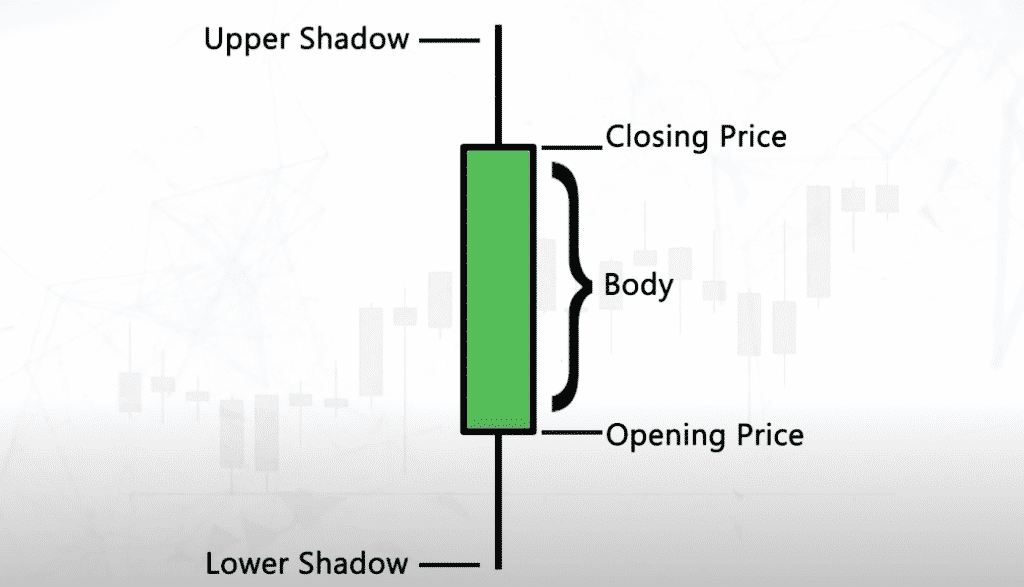
The candles represent the price action of a currency over a specific timeframe. The red and green candles indicate whether the price went up or down during that period. The wicks show the highest and lowest prices reached during that time frame.
The indicators are mathematical formulas that are used to identify trends in the price movement of a currency. The most popular indicators are the moving average, the relative strength index, and the stochastic oscillator.
The order book is a list of all the buy and sell orders for a particular cryptocurrency. It shows how much of the currency is being bought and sold at different prices. The order book can be used to identify support and resistance levels in the price of a currency.
Now let’s discuss all these factors in detail and observe how crucial these are to consider when evaluating an opinion regarding a cryptocurrency.
Contributing Factors to Observe
Market Capitalization
Market cap is a good starting benchmark. Coins with very low market caps tend to behave in a much less predictable manner and vice versa. This ties in with the volume confirmation trend. If a few people are taking part in the market, it’s very hard to get a clearer picture. If there’s a lot of activity, trends start to emerge.
Relative Strength Index (RSI)
Relative Strength Index measures price movement by comparing the current price to past performance. It boils down to a ratio between the average of days the asset was up and the average of days it was down.
Luckily, almost any exchange and the trading tool will calculate this for you.
RSI ranges from zero to 100. An RSI over 70 tends to indicate that an asset has been oversold and will likely go down while the inverse is true for an RSI below 30. By no means is this a foolproof indicator. If it was this easy, everyone would be rich.
RSI is just another tool like the rest we discussed to help you get a more clear picture of a market.
Support And Resistance
Support is the low end of an asset’s value that is often touched multiple times before bouncing up again.
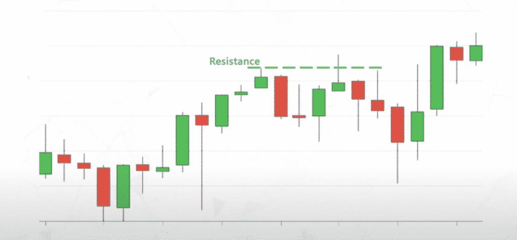
Resistance is the high end of the value that is hit before the price tends to fall back down.
They basically represent a point where people see purchasing an asset as a bargain and a point when people see selling an asset as beneficial.
So, if traders think your coin is a bargain at $100 they leap to purchase it when it hits that price and it isn’t likely to go much below there. If they think $150 for your coin is overvalued or even just a nice profit, many will sell at that point and the price won’t go much higher.
Of course, there are many other potential reasons for this to play in any given market.
But this is one way to analyze crypto charts. And now we’ll look into different types of charts and more complex tools to help you understand the market.
Crypto Charts and Movements
One of the most prolific types of charts out there is the Japanese candlestick chart, and here’s what it looks like.
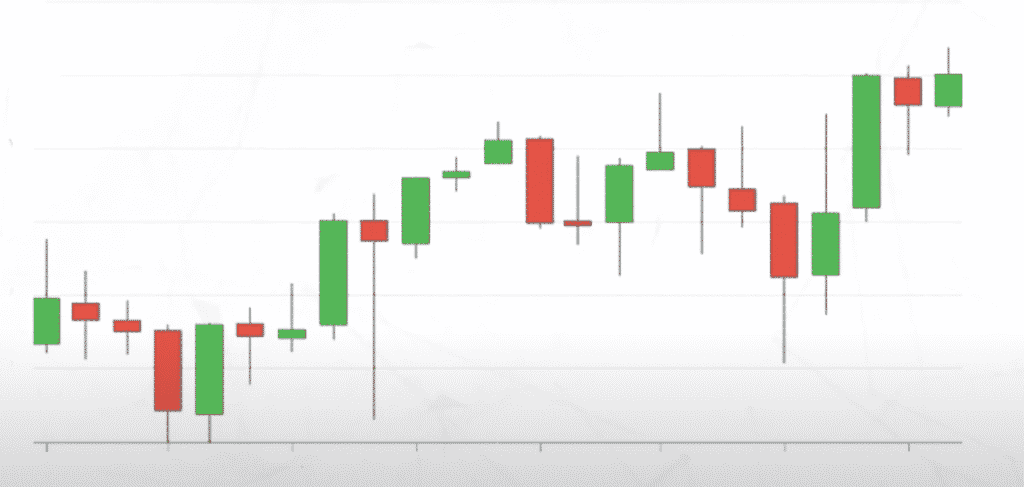
Chances are you’ve seen them before. Each candlestick represents how the price has moved over a given period of time.
The green stick means the price has moved up, the red stick means the price has moved down.
The body of the candle shows the difference between the opening and closing price of that time period. The shadows at the end show you the highest or lowest point the price has gone over the course of that period.
So, how can we use these to understand crypto assets? One of the major ways is with trend lines.
[H3] Trend Lines
Trend Lines help us to confirm and identify different trends in the market. A trendline is an upward or downward straight line that intersects at least two price points.
A strong trend line should ideally cross as many different points as it can. As a general rule, a trendline should go through two points and have at least a third point to help validate it.
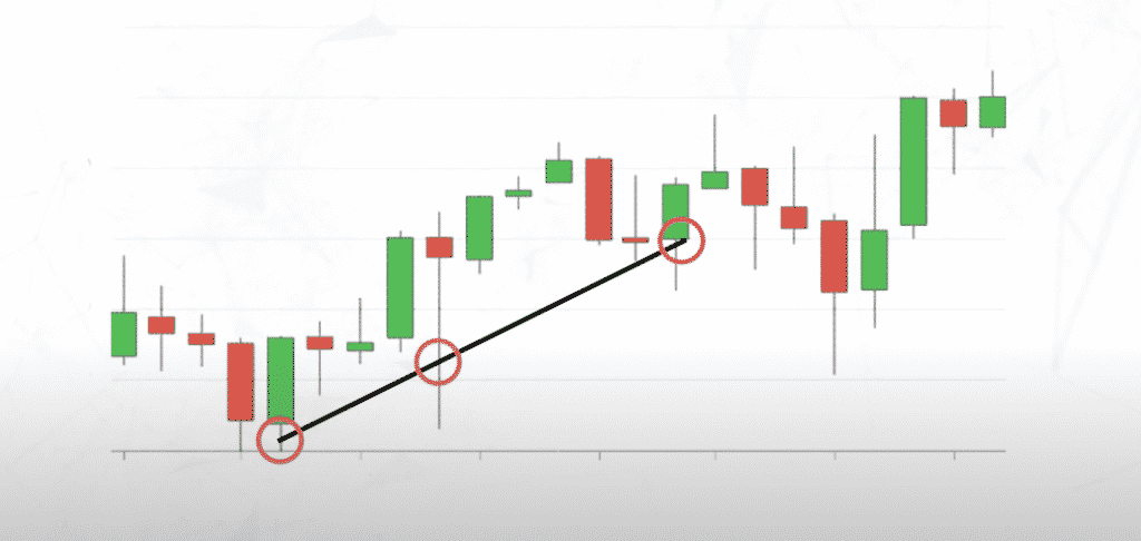
The spacing of these points is also important. If the points are really close together, you’re looking at such a small window of time that it’s impossible to confirm a trend. Conversely, if the points are too far apart, it’s hard to see that the points have anything to do with each other.
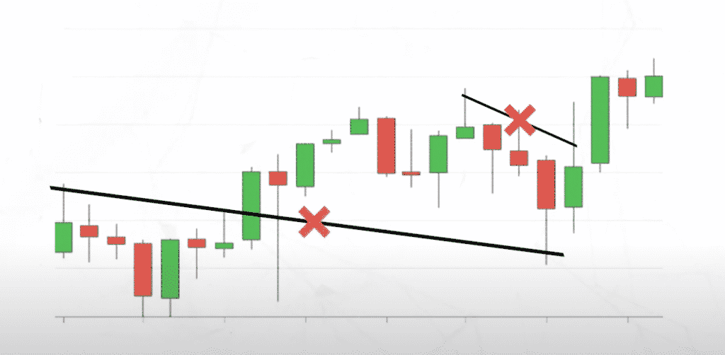
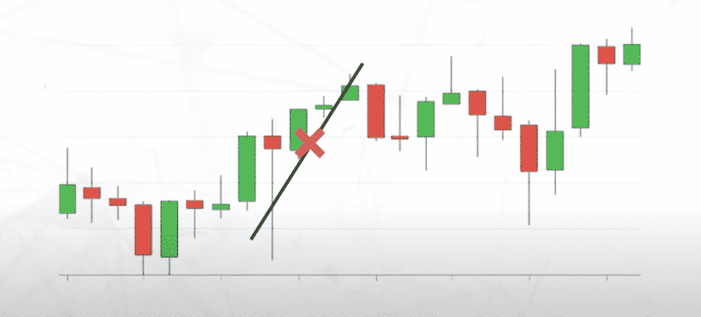
Finally, you should look at the angle of any line you’re drawing. A very steep line in either direction is unlikely to be a trend. It’s simply not sustainable for an asset to consistently rise or drop 30% to 40% day over day for an extended period of time.
Alternatively, a line that’s too close to horizontal is basically a support or resistance line that we discussed earlier.
So what do these trend lines allow you to do?
At their best, they can help you observe how an asset is moving and where it may go next.
Their biggest disadvantage is that it’s easy to draw trend lines on almost any chart. So you have to be able to recognize bad trend lines like we described, and be conscious when you draw your own because these are just a tool to help you along the way.
No system or analysis is the be-all-end-all of where a market will go. These tools may help you understand why markets move the way they do but they are not foolproof schemes for ethereum price predictions.
Simple Moving Averages
Simple Moving Averages are another more mathematical way to try and identify trends. A moving average is calculated by averaging a certain number of past data points.
When you plot the moving average, you can see a smoothed-out version of the data that is far less disjointed and fluctuating. The math looks like this:
SMA= (A1+A2+A3+…+An)/n
A is the closing price of the asset at the end of a given time period. And N is the period over which it was calculated.
If, over the last 10 days, your price looked like this:
Over 10 Days
1, 5, 4, 2, 3, 7, 6, 8, 9, 9
You can sub it into the math as such, which will give you an SMA of 5.4.
SMA10 = (1+5+4+2+3+7+6+8+9+9)/10
SMA10 = 5.4
So if you wanted to calculate and plot this data, you would continue to calculate 10 Day chunks and place them on the chart.
As we stated earlier, the result you can see is a highly simplified look at price movements with much clearer trends. When we relate this to the three major movements in Dow Theory, people usually use an SMA over 200 days to look for long-term trends:
- 50 for medium-term and
- 20 for short term
One way we can extend the data given to us by an SMA is with the Bollinger Bands.
Bollinger Bands
Bollinger Bands essentially take the SMA that you calculated above, but then also plot a positive standard deviation above a negative standard deviation below each point, creating a range for each bit of data.
A standard deviation is just a measurement of how much variance can be present in any data calculation. This is very common in statistics and finance.
Each point in your SMA will have a band above and below it. That indicates how much that average price is moved from its average and that timeframe.
When the band is very wide from the main data point – as indicated below, it means that the asset is in a period of high volatility. It’s taking huge upper down price swings that deviate greatly from the past average.
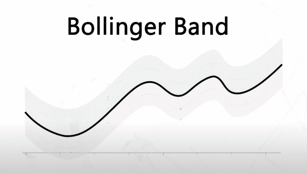
And when bands tighten around the average points (shown below), you’re in a period of low volatility – you can typically expect smaller price movements in these periods.
Bollinger Bands are a tool that can be used with an SMA to try and identify how much price volatility can be expected at a given time.
Remember, none of these tools on their own are any kind of golden ticket. Each one simply gives you a different lens to observe the movement of markets. When used in conjunction with each other. You can start to identify trends and get a better understanding of how assets behave under certain market conditions.
Tips For Using Crypto Charts To Make Smart Trades
When it comes to crypto trading, crypto charts are an important tool. By understanding how to read crypto charts, you can better predict price fluctuations and make smart trades.
Find out How to trade cryptocurrency?
Here are a few tips for analyzing crypto charts to make smart trades:
- Look at the overall trend. When you are looking at a crypto graph, it is important to look at the overall trend. This will give you an idea of where the price is headed. If the overall trend is upward, then you can expect the price to continue to rise. If the overall trend is downward, then you can expect the price to continue to fall.
- Look at support and resistance levels. Another important thing to look at when you are looking at crypto graphs is support and resistance levels. These levels indicate where the price is likely to find support or resistance. If the price breaks through a support level, it is likely to continue falling. If the price breaks through a resistance level, it is likely to continue rising.
- Look for patterns. When you are looking at crypto graphs, you should also look for patterns. Certain patterns can give you an idea of where the price is headed. For example, a head and shoulders pattern typically indicates that the price is about to fall.
- Use indicators. Indicators can also be helpful when you are trying to predict price movements. Some popular indicators include moving averages, Bollinger Bands, and MACD.
- Don’t get too caught up in the details. When you are looking at crypto charts, it is important to remember that you don’t need to get too caught up in the details. Sometimes, the big picture is more important than the small details.
- Have a plan. Finally, it is important to have a plan when you are trading crypto. This plan should include your entry and exit points, as well as your stop-loss and take-profit levels. By having a plan, you will be less likely to make impulsive decisions that could cost you money.
| Explore our Blockchain Community and Courses to learn more about crypto charts, crypto trading and everything related to blockchain technology. |
|---|
